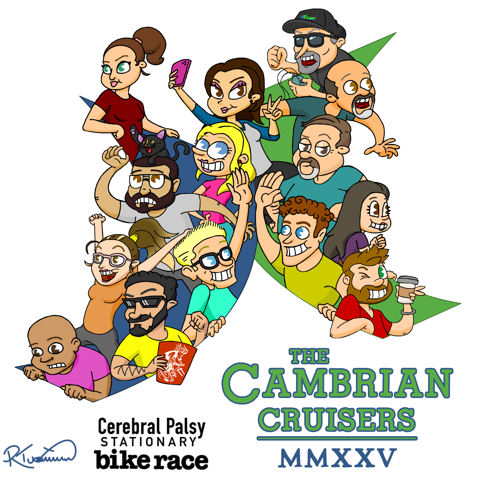
So I drew this thing:

Overall, I’m very satisfied with it. It aligns very well with the vision that I had before starting up. Of course, as an artist, I look at it and can immediately pick out a hundred little things I’d like to tweak or clean up. But I can’t; it’s already been submitted and published. So I won’t bother losing any sleep over it.
The ONE thing that I do want to grouse about is -in my opinion- the not entirely cohesive style. When I began this project, I decided to go more cartoony than I normally do. And I think that’s very clear over on the right side of the image. But as I made my way up and around through the various characters, I think I kind of lost sight that direction and faded a bit into my more usual style; I got a little too distracted by trying to figure out how to make each person at least somewhat recognizable and distinct. And it’s fine! It’s not a big deal! I don’t think anyone but me would even notice. But it bugs me just a little.


