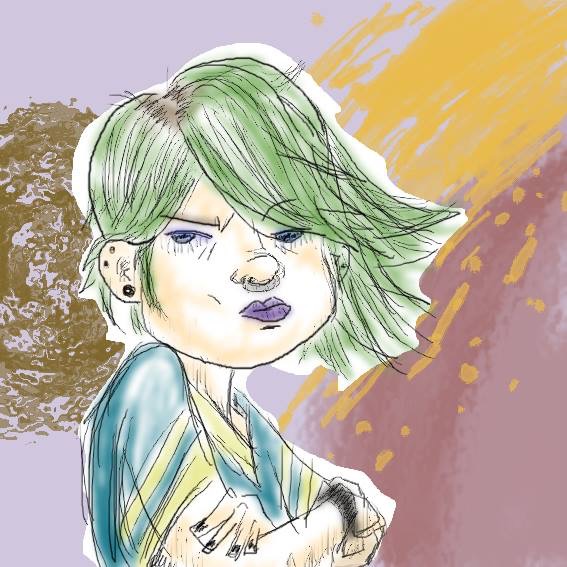
After posting all those comics last month, I suppose it’s only right to follow up with some less panel-bound doodles. Like this one here!
The more I look at this, the less it looks like something I would have drawn. But I did! Make no mistake about it! This is entirely a product of opening up Photoshop and just going with the flow. Literally the only thing that I had set out to do was to draw something in Photoshop instead of Flash. Get with the times and all that, you know?
When I started doodling, I thought “okay, how about.. a girl?” because apparently that’s all that I think about, and started drawing her hair. This is decidedly not the girl I had originally envisioned, but that’s how spontaneous art works, I suppose? I was happy enough to leave her in black and white, as well. But then I decided to start fooling around with different brushes and filters, and couldn’t help but give her a… dynamic(? Is that the word I want?) coloured-in look.
To be honest, I really wanted to give her a watercolour-looking fill. It’s safe to say that’s not quite how it worked out, but the result made me happy anyway. I used a softer brush and then applied a Gaussian blur filter for emphasis. I don’t really understand what makes the Gaussian blur different from the regular blur, but it sure made my picture look better!
Another important note is that I did all the line work with the thin default brush, but there’s actually a pencil tool as well! I should have used that! I’ll use it next time. I suppose this is a lesson in paying attention to the options that are very visibly right there in the toolbar. I don’t know if the pencil does pressure-sensitivity, though. I’ll have to try to remember to check that out before committing.
I don’t know where the septum ring came from. Not really my jam. But it has given me an idea for something else that I’m really excited to draw…
Something I’ve learned about myself in recent years, however, is that I definitely have a thing for green hair. Rowr!
I had exactly no ideas on what to do with the background. I was already well past my bedtime at that point, so I wasn’t going to draw in anything elaborate, but I couldn’t very well leave the young lady on a stark white background. And then I wondered how I was going to deal with the fact that she wasn’t solidly filled with colours. I think the “cut-out” look that just sort of happened looks really great, at least when paired with the background. And said background is another set of experiments with different brushes and filters. You have no idea how many undos went into that.
What I love the most might be surprising – the orange paint-splatter-looking thing in the top right. It ain’t perfect, but by gum it’s the closest I’ve ever gotten to pulling off that look properly. It makes me want to draw lots and lots and lots of Splatoon art. Which will most likely be the subject my next project. If nothing else, it’ll be great practice for refining my technique.
There’s still a ton to learn and plenty of room to improve, in terms of both art techniques and using Photoshop’s many tools, but I think I’m off to a good start. If nothing else, breaking out of the confines of Flash will allow me a lot more freedom of style. It’s hard to do anything but cartoons in Flash. Perhaps I will finally discover a way to properly express myself through art. This should be a lot easier than learning to write and play music, at any rate.

