The Wii U is dead and I’m the only person who liked it.
Okay, maybe not the only person, but some days it sure feels like it. Wii U lived a short and underwhelming life, but it was home to some of the best games that I’ve ever played. Super Mario Maker, Splatoon, Yoshi’s Woolly World, Xenoblade Chronicles X, et cetera, et cetera. It’s also host to some absolute stinkers. Games so bad that no person should ever have to suffer their existence.
Fortunately, these games are squirreled away in the depths of the eShop, where they can be forgotten and die without harming too many with their terribleness. It’s very much opposite the Wii, where there were rows and rows of awful shovelware populating store shelves, tricking naïve parents into buying the absolute worst games for their kids.
As a bit of a last hurrah before the Switch’s launch in a few days, here is a short list of six Wii U eShop games that nobody should ever play. Not that you would. Because you don’t own a Wii U. Jerk.
So why did I buy them, you ask? Either because I thought they may have some legitimate merit to them, or they were on sale for a dollar (give or take) and I figured they’d be good for a laugh. Your job is to figure out which is which!
The Letter
Developer: Treefall Studios
Release date: July 10, 2014
Crap rating: 4/5
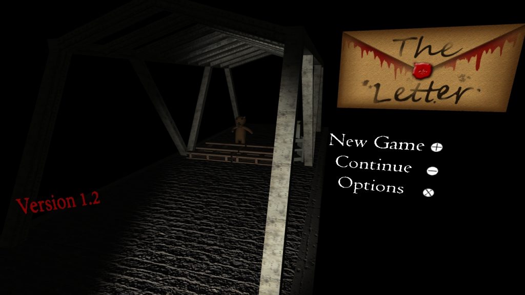
This is very much akin to a large number of trash indie games that I’ve played on Xbox 360. I would have ignored it completely save two factors: the review on NWR, which made it sound delectably bad, and the fact that it went on sale for a whopping thirty cents at one point. How could I say no?
It should also be noted that this was one of the first games of such… unique calibre to appear on the WiiU eShop. There had been stinkers before, but nothing quite on that XBLIG level. People went a little nuts over it, crying out that it wasn’t even a real game and should be removed from the digital storefront. Truly, gone are the days of the Official Nintendo Seal of Quality.
Anyway, this is a first-person explore-’em-up wherein you’re searching through a number of crappy-looking environments for your missing father. Its intent is to be a horror mystery, which is honestly pulled off fairly well. I mean, for a game with otherwise very shoddy craftsmanship. The horror is all in the atmosphere, which is suitably spooky, and the slowly unravelling tale of what happened to your father. There are no jumpscares, just dark environments with spooky noises and once in a while, a disembodied voice.
To sum it up, The Letter is a 20-minute game that charges you with wandering about and looking for random gewgaws before getting shuttled off to the next map. And then in the end it was all a dream. In retrospect, it’s a shabby herald of all the cheaply-made walking simulators that would follow in subsequent years. It’s not a game that anyone should waste their time with, but at an admission price of thirty cents, I can’t say I was disappointed.
Molly Maggot
Developer: Gnob Software
Release date: December 31, 2015
Crap rating: 5/5
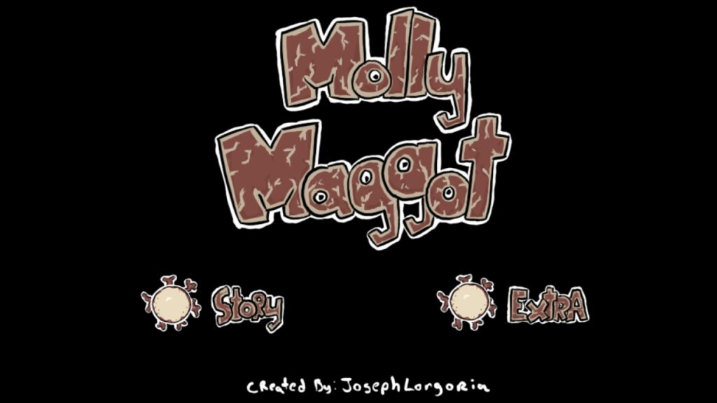
I’m not going to lie, I was 100% intrigued by this game because of its M rating by the ESRB. What could this ugly little game about a maggot chewing through rotting flesh possibly do to merit such a rating? As it turns out, nothing at all. The pre-release rating must have been messed up somehow, and it’s actually been ranked down to a humble E10+ for fantasy violence and mild blood.
What is left, then? Not much, unfortunately. I have booted it up three times, and each time I have completely failed to grasp the goal of the game. You play as the titular Molly Maggot, and you’re charged with chomping through blocks of dead flesh to… find an exit, ostensibly. But despite having fairly thoroughly checked behind as many flesh blocks as possible, I could never find a way out. Which means either the exit is randomized or I’m an idiot.
Complicating matters is that certain blocks are harmful to the touch, and there are other bugs roaming about that will kill you. The harmful blocks are often placed in very difficult to avoid spots, which means you’re definitely gonna need to tank a few hits, and Molly only has three health bits.
The developer did update the game at one point, though I’m not entirely sure what changes they made. I think they added a few power-ups to help ease you through the very difficult game, but they didn’t make a lick of difference to me.
I don’t know, maybe there’s more to Molly Maggot. Maybe there’s something good buried under the cruft. But I’ll never know. Because I can’t get past the first screen. And that, my friends, is reason enough for me to write off this lump of festering trash forever.
Stone Shire
Developer: Finger Gun Games
Release date: May 21, 2015
Crap rating: 5/5
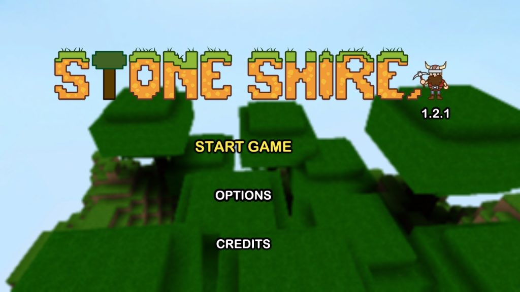
You know Minecraft? It took years and years for Nintendo to finally get it on WiiU. I’d write that up as one of the system’s biggest failings. Of course, indie developers of all shapes and sizes saw that need, and tried to fill it with their own half-baked Minecraft wannabes. This is the story of one of those wannabes.
The first thing that absolutely needs to be mentioned is that Stone Shire is lacking in everything but the very most basic gameplay. You can break blocks and you can place blocks, and craft about four different things. That is it. That’s literally it. The map is also teeny-tiny. Maybe about 100x100x100? It’s a miniscule little cube that you could clear of blocks in no time flat. There is literally no reason to play this game unless you are that desperate for a Minecraft fix.
To sum it up, there is nothing in the tiny world, you can’t craft anything but pickaxes and doors and a torch, and the game also suffers from some horrendous slowdown. It’s a big ol’ turd if I’ve ever seen one. What makes it all the more hilarious is the following line from the developer blog:
It was meant to bring a block-building experience similar to Minecraft to the Wii U. It was also meant to be transformed into something more like Elder Scrolls. Unfortunately, a lot of these features I was unable to include in the game, both due to the limitations of the system (and the Unity engine) and me simply being a one man team…
I can understand the pressures of being a lone developer, but yeesh. You couldn’t even build Minecraft. How the heck did you think you were going to build an Elder Scrolls game?
Psyscrolr
Developer: Actos Games
Release date: April 2, 2015
Crap rating: 4/5
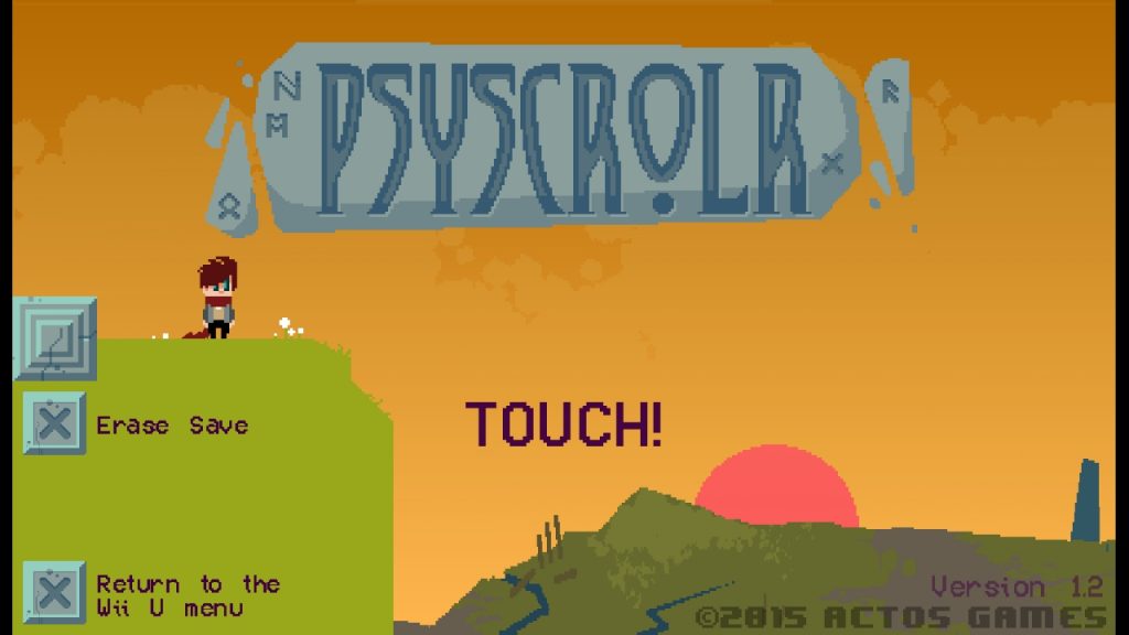
The last three games were pretty obviously trash to the keen eye of the discerning video game enthusiast. I purchased them as curiosities, and because they were a dollar or less. Psyscrolr, on the other hand, looked like a decent little action platformer from the little footage that I saw pre-release. And that’s why it left me so bitterly disappointed.
The first and most glaring issue with Psyscrolr is that it’s controlled with a combination of actual controls and touchscreen, when touchscreen controls have absolutely no place here. Moving and jumping are done with the controls stick and L button, which is fine, but all of your attacks are directed by tapping the touchscreen. This means that your projectiles are often going to miss, and melee attacks often don’t even work. Hooray!
Psyscrolr is then a series of unbelievably tricky jumps and unwieldy combat which culminates into the most frustrating vehicle level ever devised, capped off by almost unbearably difficult boss. I should have given up during the stupid vehicle level, because what follows is not worth the hassle. The game ends after the first boss, because apparently the developer decided to sell it before finishing it. Awesome! At least the graphics are nice.
An update came out a while back, and I don’t know exactly what the details are, but they made it so that you can use the melee attack with the press of a button. Which is nice, but your shot is still mapped to the touch screen, and that’s the attack you’ll want to use 95% of the time. So it’s a moot improvement. I recall hearing that there were more levels included in the update as well, but either I’m too stupid to find them or they’re not actually there. As far as I can tell, it’s still just one-third of a game.
Maze
Developer: Treefall Studios
Release date: January 8, 2015
Crap rating: 3/5
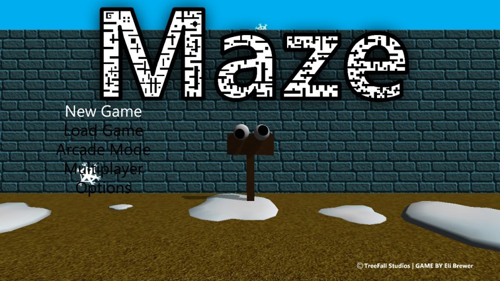
Who would even believe that TreeFall Studios would keep releasing games after what happened with The Letter? But they did! The gall!
Maze is a very different beast than good ol’ The Letter. It’s still a first-person explore-’em-up, but this one has you conquering a number of small mazes in your quest to… Uh, I forgot. I honestly don’t know why anyone would waste their time tacking on a terrible story to a game about wandering through mazes, anyway. You get dropped in a maze, collect ten coins, find the exit, repeat with increased complexity. Why not just leave it at that?
Besides the dumb story, there are a number of other reasons to push Maze in the mud and laugh at it. Number one is the cardinal sin of so many bad games: bad controls. I don’t really know how to explain it, but there’s no “give” in the movement. Like, if you move the control stick even a hair away from straight up, your guy will careen off to the side and into a wall. And he gets stuck on the walls, too. Which is ridiculous on a whole different level.
In a game like this, bad controls wouldn’t normally be insurmountable. You can bumble your way to the end of most mazes without any major issues. What really hurts is the few times that precision jumping is involved. First-person platforming is iffy even when the controls are tight, and the slippery movement in this game made it so much worse. Maze 5 introduced platforming challenges, and I got so frustrated trying to clear them that I ragequit and was ready to give up on the game forever.
I had to boot it up again to grab a screenshot, though, and I decided to give it one more try. Of course I nailed it on the first attempt after I had cooled off. I proceeded to play through roughly a dozen more stages before getting overwhelmed by one particularly large maze with bright neon walls that were continually changing colour. I got so hopelessly lost, and it was giving me a headache. Of the sixteen mazes up to that point, it’s the first one where I felt that a pen and paper map would be necessary to clear it.
The strange part is that I found myself actually enjoying Maze at that point. I don’t know how much longer it is, but I think I’ll probably go back and try to finish it. I actually feel a little bad about including it on this list now. If I still need to justify its placement, here’s the list of offenses: bad controls, bad story, bad graphics, and platforming where it doesn’t belong. If you can see past all of that, it’s actually not the worst way you could spend two bucks.
FreezeME
Developer: Rainy Night Creations
Release date: Feb 4, 2016
Crap rating: 2/5
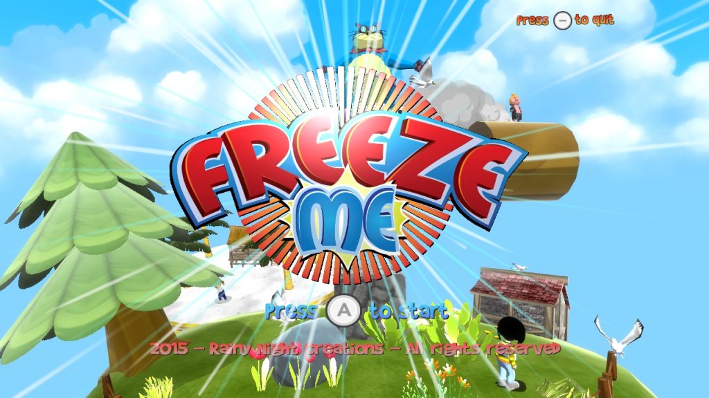
Normally indie games like to bank on 8- and 16-bit nostalgia. Here we have an indie game that is supposed to evoke the feeling of 64-bit collectathon platformers. This is exactly what I wanted! I love Nintendo 64 collectathon platformers!
Unfortunately, FreezeME is a little bit lacking in the “fun” department. The controls are slippery and your character doesn’t always move the way you expect her to. Her jump momentum is all over the dang place. This makes platforming considerably harder than it ought to be. And don’t even get me started on swimming. Yecch. All in all, the simple act of moving around can be enough of a trial to have turned me off.
That’s the worst of it, but not the end. Other issues include: questionable collision detection, an empty and pointless hub world, and all sorts of glitches. Like how sometimes you will just fall right through a solid platform. Or perhaps a boss’ health meter will forget to fill, rendering it completely invincible. In fact, the first two times I played the game, my sessions were ended unexpectedly because it locked up on me (in two different ways). There was a patch at some point, which I can only assume squashed some of the more egregious bugs. Unfortunately, it didn’t improve the basic gameplay.
FreezeME’s big, unique feature is based on the main character’s camera. When you take a photo of something, it will temporarily freeze in place. Moving platforms and enemies are the obvious targets for this ability, but sometimes you’ll use it in unexpected ways, like freezing a clock’s hands to stop a challenge timer. I’ll be honest, for the couple hours I played, they came up with some very clever ways to use the freeze gimmick. So good on them for that!
Outside of all the problems, it’s a pretty stock-standard Super Mario 64 wannabe. It’s got all your usual level tropes, and a number of missions to complete with in all of them. You’ve got platforming puzzles, races, boss fights. All the usual stuff. Besides the camera-freeze gimmick, it really doesn’t do anything to stand out. FreezeME may not really belong on this list, because it’s not really all that terrible. It feels complete and it’s generally playable. It’s mostly just disappointing, though it is far too janky to be considered good.
~ Honourable Mention ~
PixlCross
Developer: PixlBit Studios
Release date: March 31, 2016
Crap rating: 1/5
Okay, so, you know darn well that it’s against my nature to suggest that a picross game might be any less than perfect. But this indie-developed take on nonograms is pushing the boundaries of what I can handle.
On the surface, it seems excellent. It’s picross. There are hundreds of puzzles. You can create and share puzzles online. There are four challenges for every baked-in puzzle, giving you even more reasons to come back and play more. And it’s the only picross game on Wii U, so you really don’t have a lot of choice anyhow.
But… you’re forced to use the touchscreen to play. I do not like to picross with touch controls. They’re imprecise, and I depend on that tactile feeling of a button press to count how many boxes I’m clicking. PixlCross takes it to a whole new level by force-zooming in on the puzzle, and sliding it around at very high speeds when you get close to the edge of the screen, almost guaranteeing that you’ll make mistakes because it’s sliding around without your input. It’s a huge hassle and I hate it.
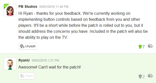
What’s worst of all is that I posted about my gripes on Miiverse, and not an hour later, the developers responded, thanking me for the feedback and saying that they were working on a patch with button controls. See:
I think you’ve probably already guessed that this patch never happened. Other Miiverse users have asked in the interim what happened to said patch, but all they’ve gotten is radio silence. PixlBit Studios has either gone under, or given up completely on improving PixlCross. Oh well.
So there you have it; six terrible eShop games, and also a bonus one that is only terrible-ish because its developer doesn’t care anymore.
You should be aware that these are by no means the worst of the eShop. Not even close. It’s filled with all sorts of $1.99 garbage and Flappy Bird clones that aren’t even worth writing about. But these are the terrible games that managed to win my attention and my money, despite having the odds stacked against them. And honestly, the only one I truly regret buying is Psyscrolr. Because FreezeME isn’t actually that bad and the rest only cost me a dollar each.
That said, I still don’t recommend anyone ever buy any of them. If you’ve got a hankering to check out some terrible indie games, maybe. Just promise me that you’ll wait for a sale.


