
I’ll start off with a rather painful admission: I don’t know anything about music. I know about bands and a little about the industry and how to tell a hack from a real artist, but that’s about as far as my “expertise” goes. And yet I love to pass myself off as someone who truly understands music. I suppose it comes from my inner hipster’s need to have superior taste to everyone else.
The problem this presents is that I still long to talk about music as if I know anything about it. Look back through the archives for posts tagged “BOTM” and you’ll see some of my finest attempts to pass as a connoisseur. I think the fact that My Chemical Romance was the first or second Band of the Month put that dream to bed before it even really got going.
So, in the spirit of talking about music without actually talking about music, I’ve come up with a brilliant plan. Actually, I didn’t come up with the idea. It’s stolen wholesale from Dinosaur Dracula, and I won’t even bother trying to pretend it was my own stroke of genius. I may be a hack, but at least I’m honest about it.
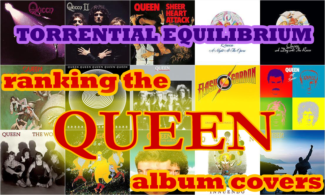
More to the point, I’m going to review and rank all of Queen’s studio albums. Well, the album covers, anyway. Just in case the article’s title didn’t tip you off. I don’t really know a lot about art design either, but I’m certainly more qualified (at least in my own mind) to talk about that than the actual music contained within.
I think this intro has gone on more than long enough now, so let’s maybe get down to business, yes?
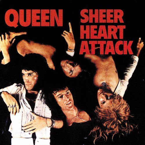
 15. Sheer Heart Attack
I know 1974 was a different time, but I just don’t see any appeal to this album cover. It’s absolutely the one I’d be least likely to pick out if I knew nothing about Queen and had to pick from the lineup of covers alone. Just look at the thing. A bunch of long-haired dudes in various states of undress. Sure, it’s true that I idolize these dudes, but it’s certainly not for their sexiness. There’s just nothing there for me.
But the shirtless band members are only a part of what turns me off of this album. I’m really disappointed in the font they chose. I mean, really. Chunky red block letters? That’s the absolute most fitting thing you could come up with, guys? I guess that maybe it’s a silly gripe, but that’s about the best I’ve got here. Probably the thing that bothers me the most about it is that even I wouldn’t be so lazy as to use something like that. There’s a time and place for Arial Black, and it’s not album covers.
On the upside, Sheer Heart Attack is a pretty great title. But as far as first impressions go, it definitely comes second to the actual cover artwork. Even though it jumps out at you in big block letters.
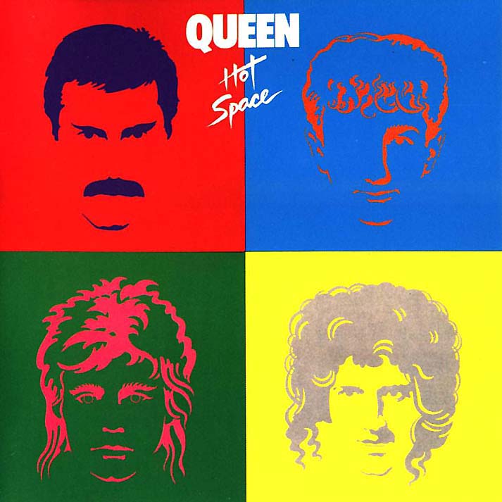
14. Hot Space
Finding the right place for Hot Space on this list was incredibly tough. On the one hand, it’s pretty colourful and really does a good job of catching the eye. On the other hand, it’s too colourful and comes off as more gaudy than anything. It’s really hard to look at for very long.
The best way to describe it, I suppose, would be “short-term visual appeal,” which is fine for movie covers, but I feel like album coves are a better place to display something unique, because it’s really hard to give people an impression of the music on the album through a single image. So why not go whole-hog and do something really cool with your cover?
Hot Space’s low position also has a lot to do with my overall disdain for pop art. Seriously. Yuck. Doesn’t appeal to me in any way. Pop art can go straight to Hell. Damn that Andy Warhol.
The one saving grace here is that it’s one of only three album covers to feature Freddie Mercury’s trademark ‘stache. Anyone who knows me at all is well aware that I am absolutely biased towards handsome moustaches, and Freddie’s is like number 2 on my list.
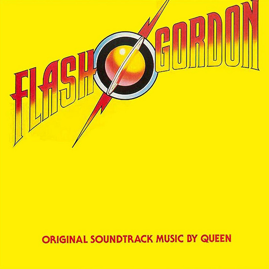
13. Flash Gordon
You might think that, being a movie soundtrack, this album doesn’t really belong on this list. But it’s considered a true Queen album on Wikipedia and it’s on that one poster I have with all the album covers, so I have to include it.
The saddest truth that I’m going to rock you with in this article is that I have never actually seen Flash Gordon. I know, I know. What kind of geek am I, right? Honestly I blame the 1996 cartoon for boring me away from the franchise. I’ve also never listened to the soundtrack and I’m not even sure I own it. I could always turn around and look at my CD collection, but ehhhh.
For the first time on this list, I think that the album cover actually benefitted from the time period in which it was released. Why? Just think about it. If this was a modern day soundtrack, it’d be covered in explosions and the actors in their most serious movie poster poses, and probably a lot more text indicating that it’s “The original soundtrack to the major Hollywood blockbuster!!” and “Based on the comic strip graphic novel by Alex Raymond!!!” Instead, we have a fairly clean, if unnecessarily yellow cover, with only the minimum required text. I quite like it.
I won’t lie though, the slant on the title logo really bothers me.
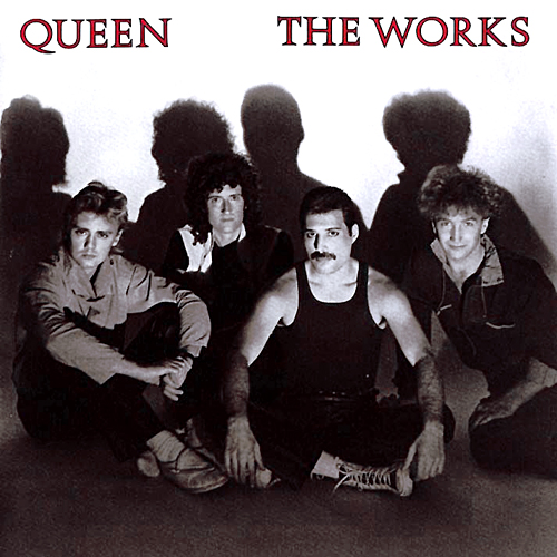
12. The Works
Here we have another example of probably the least inspired album cover you can produce: a photograph of the band. I had a very hard time making the decision of where to place this one.
I like that it’s an overall better photograph of the band than the one on Sheer Heart Attack. Mostly because it doesn’t look like it could double as a cover for a gay porn video. I mean, it could, but it’s certainly wouldn’t move many units with this cover.
Sometimes it might seem like I’m a master of double entendre, but the truth is that it’s normally just a fluke.
I guess it could stand to be a little more exciting though. Coming down off Hot Space and Flash Gordon’s blindingly bright covers, the grayscale photo just doesn’t really command your attention. It’s a little sad, but there’s just very little there to be interesting. The red font does pop out against the colourless picture though, and it’s nice that they used a font with a little more personality than Arial Black this time.
The fact of the matter is that I ranked this one entirely on the moustache. It’s the one and only live appearance it gets on any of the studio album covers, so that counts for a lot.
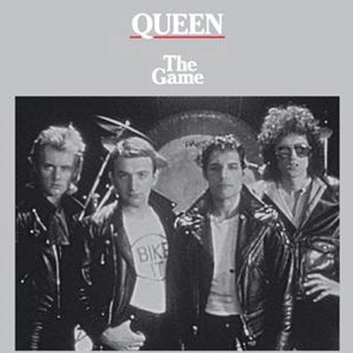
11. The Game
“Now, Ryan,” you’re saying “this cover has most of the same problems that you pointed out about The Works. How could you have possibly decided to give it a higher ranking?”
It’s true. The two are more or less interchangeable: They’re both grayscale photographs of the band. The Game here doesn’t even have the Mercury moustache to give it those bonus points that kept Hot Space and The Works from being even lower on the list than they are. Does this one have some kind of secret characteristic that makes it special?
No. Not really. The fact of that matter is that The Game has a pretty boring cover. There’s no two ways about it. There’s just nothing exciting going on here. Even the title is tiny and white and doesn’t pop.
The reason I gave it higher billing is because at least it’s a photo that’s more evocative of a band than the one on The Works. They’re dressed up cool and there’s a drum kit in the background. Are they Roger Taylor’s drums, or is it just a prop drum kit that the photographer provided? Who knows? It doesn’t matter. On The Works, they’re just sittin’ there all casual. There’s no visual indication that they’re a band. You might be picking up a comedy CD for all you know. At least with The Game, there’s a halfway decent indication that you’re buying music.
True story: for whatever reason I always think of the Stray Cats when I look at this cover.
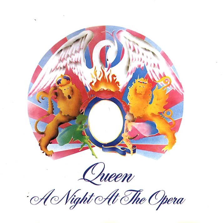
10. A Night At The Opera
A Night at the Opera might just be Queen’s most well-known album, and what a coincidence that it’s the front cover debut of the illustrious Queen crest. It first showed up on the reverse-side cover of Queen (the first album), but it took four albums before it was able to take center stage.
But this isn’t a history lesson! It’s an amateur review of sorts. I’ll start by saying that I really like this cover, and I feel bad relegating it to such a low spot on the list. The simplistic design is right up my alley; this is the kind of simple, focused cover art that I would use if I ever released a CD for some reason. It’s just that pretty much everything that ranks higher does something much more visually interesting, and I have to give credit where credit is due.
I think the crest is pretty neat too. It’s a combination of all the band’s zodiac signs (Cancer, two Leos, and a couple fairies representing Virgo), all surrounding a big ol’ Q. Then there’s a big bird there too, which is supposed to be a phoenix but doesn’t look like any depiction of a phoenix I’ve ever seen. More of a swan, if you asked me. Regardless, it’s a pretty ballin’ crest, and I especially like that the crab is on fire for no reason. At first it looks like maybe it’s the fire that the phoenix is rising form, but nope. The crab is on fire. Maybe it’s a fire crab.
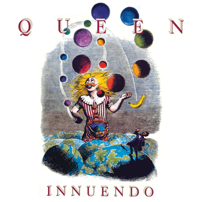
9. Innuendo
I don’t even know where to start here. Like, what even am I supposed to think about this? This is absolutely the most nonsensical cover of the bunch, and while I can’t say that I love it, I do find it appealing in a baffling sort of way.
The most distressing thing to me here is what the album’s title does to it. I’m not too clever, so I have no idea if this cover is supposed to be an innuendo or if it’s just a wacky cover. Most of the other covers don’t have anything to do with the album titles, but this one is just so different from anything else that I can’t help but wonder.
Heck, I can barely even figure out what’s going on here on the literal level. I mean obviously we’ve got a giant clown in a field of Earths. He’s juggling, but I’m not sure how the juggling is working. Is he doing the small balls with his right hand and the big balls with his left? Where did the banana come from? Is he wearing a fanny pack? Who is that little man over in the corner? What does it all mean???
It’s maddening and inspiring at the same time. If nothing else, Innuendo’s cover is the only one that really makes me think.
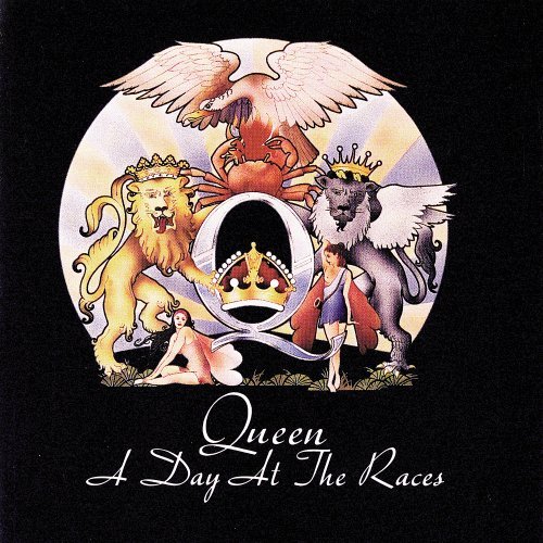
8. A Day At The Races
Wait a minute, this is just A Night at the Opera but with a black background! Or is it?
Yeah, it pretty much is. The overall design is the exact same, and truth be told, I prefer a minimalistic design like this much better when presented on a white background as opposed to the black one here. It just looks cleaner, you know.
But, I did rank this one a couple spots higher, so I suppose I’d better start reasoning that one out, yes? Take a look at the crest here for a minute. Let it really sink in. Then scroll back up a bit and take a look at the one on A Night at the Opera. You might notice that there’s a pretty shocking difference in detail there, and that’s why I gave this one a better spot. Nothing deep or meaningful, I just like that the artwork here is much more refined.
Honestly, when you put the two next to each other, I think the A Night at the Opera crest looks more like a shabby Colorforms set than an actual piece of artwork. The phoenix even looks a little more phoenix-like here, and one of the fairies is flashing a boob. How could this one not be better?
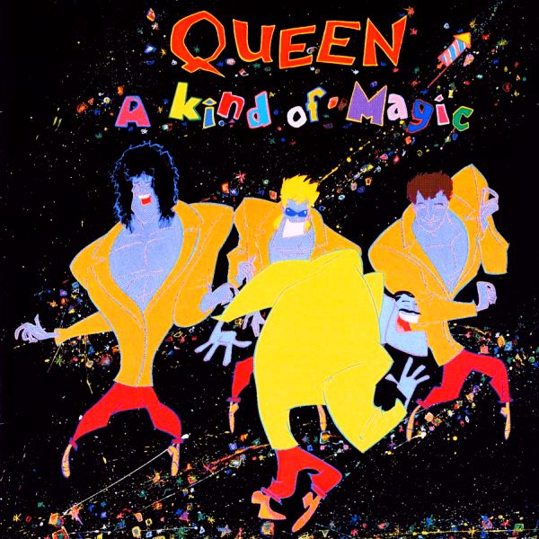
7. A Kind of Magic
No bones about it, A Kind of Magic gets its middleish placement because it’s got a fun cartoon depiction of the band members, and that’s unique among these covers. You should already be well aware that I’ve got a huge soft spot for cartoons, so there’s no doubt that this one was going to crack the top half, at least. You’ve even got a double whammy there when you consider that we get a cartoon version of Freddie’s moustache. Not quite as epic as the real thing, but appreciated no less.
I’ll admit though, that while I’m a fan of the cartoon band, I’m not so crazy about the wacky font or spackled background. I mean, I guess that the background fits pretty well with the design, but I feel like it still could have been designed better. If you look really closely, you’ll see that it’s not a plain rainbow spackle, but rather a series of tiny two-toned geometric shapes. It also looks like it’s designed in such a way that it’s a trail made by that small firework flying off the top of the image. It’s all kind of weird. It seems kind of like a few different ideas roughly mashed together, and they could have used a single, more cohesive idea instead. I honestly don’t know what the thought I’m trying to express even is anymore. It’s just words on a page at this point.
As for the font, it’s just too wacky. Whoever decided on it was trying way too hard to make it look cartoony.
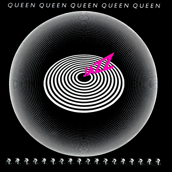
6. Jazz
I really like the Jazz cover. It’s simple, yet there’s still enough going on that you actually have to take a close look at it to notice all the little details. Okay, maybe there isn’t that much going on, but I still really like the look of it. In fact, I’m worried that at some point down the road I’m going to read through this and bump it up a spot or two.
The overall design is really nice and clean, with the bullseye pattern sitting square in the middle, and then the “bubble” around it reflecting it in different ways. I don’t even know how to explain what’s going on there, but it looks really nice to me. The image makes me think of a record player for some reason, even though I know that the title, which would be the needle, should be placed on the “bubble” part to really sell that imagery. Whatever. That’s what I think of when I look at it, and you’ll never change that with your damned “facts.”
If you look really closely, you’ll notice that the pattern along the bottom of the cover is a lineup of cyclists. That’s because “Bicycle Race” is on this album, and it was kind of a big deal.
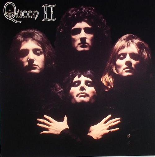
5. Queen II
Try as I might, I can’t explain what it is about this cover that made me put it so high up the list. Maybe it’s got more to do with the cultural impact that it (along with Bohemian Rhapsody) has had than anything I like about the artwork specifically. I mean really, this is probably the most iconic piece of Queen imagery there is. Or maybe not. I’m not too sure.
Google image search seems to confirm that in fact it is. I’ve gotta stop second-guessing myself.
That aside, yeah, it’s pretty much just another band shot. But this one is dramatic and mysterious! Maybe even a little spooky, but your mileage may vary on that one. I guess really all that I can say about this one is that it’s a pretty good example of how to use a photo of the band effectively. Doing something -anything- to make it more than just another picture of people standing around is enough to make it stand out.
Gotta love how all the makeup and hair make them look so effeminate. Except for Brian May. John Deacon is blurring the line there, but Roger Taylor and Freddie Mercury are definitely showing their feminine sides here.
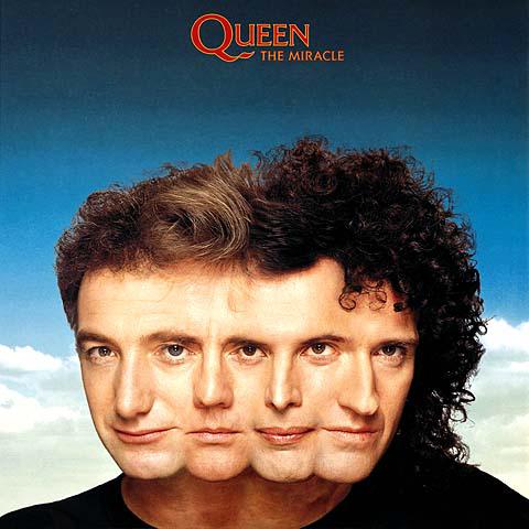
4. The Miracle
And here’s another example of how you can turn a band shot into something wholly original: mash ‘em all together!
This, I think, is the hardest one to justify. Or at least is the hardest one to justify with between 200 and 300 words. I really can’t think of anything other to say about it than that I think it’s really cool and how I like how original it is. Is it really fourth place material if I can’t find a way to write three paragraphs about what I think about it? Maybe, maybe not.
What I dislike about it is that Brian and John get a lot more visual space than Roger and Freddie. It’s definitely because they got to be the end pieces, but it makes me wonder how the order was chosen. Especially since Roger and Freddie would be the “pretty ones” of the four. I suppose Brian had to be on one of the ends though, because what would Brian May be without that hair? A fantastic guitarist and inspired songwriter without a head of massive, curly hair, I guess.
Oh my goodness, I seriously can’t pad this one out enough without this stupid filler sentence.
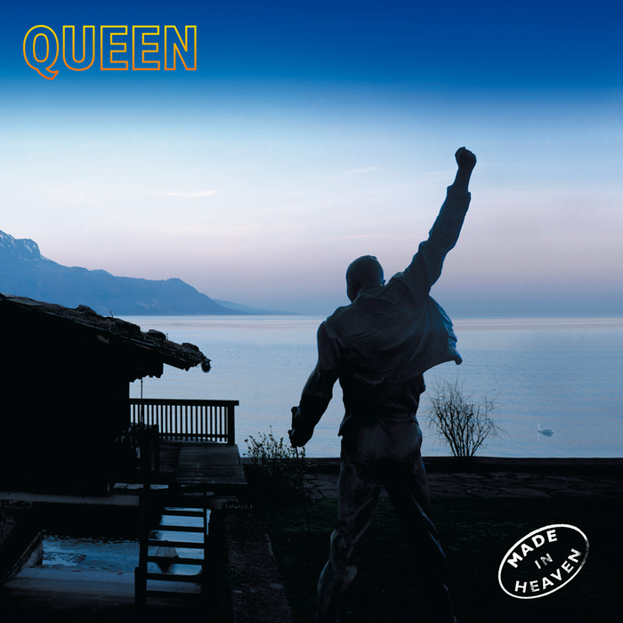
3. Made In Heaven
Back when I was second guessing whether the Queen II album art was the most iconic Queen image or not, this is the other image that brought on my waffling. Not the entire cover, mind you, but simply the figure of Freddie Mercury punching the air in triumph. That’s the pose they chose for the statue they made of him, anyway, and it’s the pose that would come to mind for me when I think of iconic Queen imagery.
Anyway, the cover. I really like it, but since we’re in the top three now I shouldn’t have to type that, should it? It evokes a really strong sense of serenity in me. The blue sky is immediately calming, and because Freddie is silhouetted and most of the foreground is shadowed, it makes me think of dawn, which I find to be the most calming and peaceful time of day.
All that said, I have no idea what’s up with that little shed or cabana or whatever that building is over on the left. I probably should, but I don’t. It’s mystifying.
The shocking truth of it is that on the first draft of this list, I’d placed Made in Heaven at number one. If I weren’t so committed to giving out solid ranks, the top three would probably all be in a three-way tie.
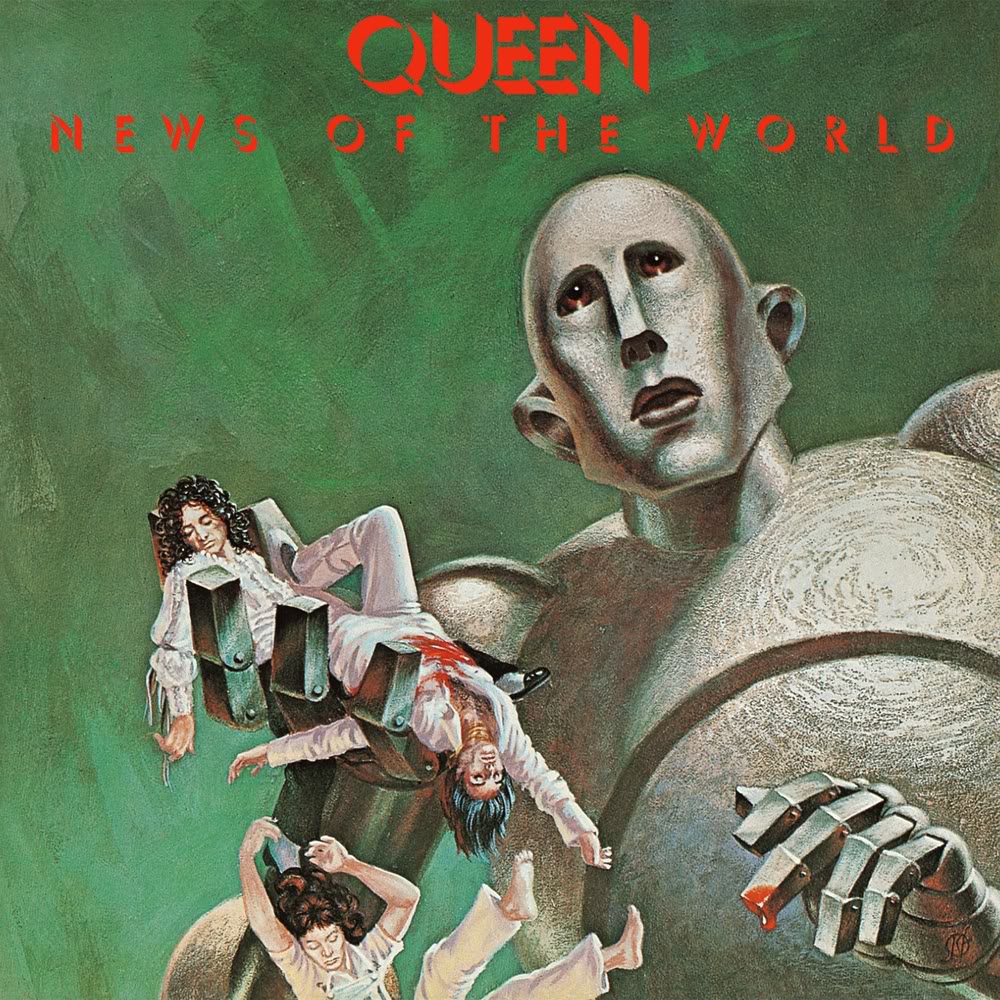
2. News of the World
Did you really think that News of the World would rank any lower than somewhere amongst the top three? Of course it wouldn’t. Just look at that cover! It’s… it’s so cool. And a little frightening. I just don’t want anybody thinking it made its way up here because of that one episode of Family Guy where it featured as a plot point. No, News of the World earned its placing just by being its awesome self.
I guess you may look at it and wonder how an album cover where the band is being squashed by a giant robot would be a good thing. That’s ‘cause y’all just don’t understand. Look at that robot. I can’t say for sure whether he can show emotion or not, but I’m assuming that his metal face can twist and flex like that of a flesh-man. Nobody would build a robot that permanently had such sorrowful eyes. Look at his expression. He’s not sure what’s going on. He just wanted to play with the band, and now they’ve stopped moving. He doesn’t know what’s going on. He’s naïve and doesn’t understand his own strength or that people are not constructed as durably as he is. I’m sure that if given the chance, the ghosts of Queen would forgive him for his mistakes. The common people would not though, and the poor robot will be persecuted for crimes he doesn’t know that he committed.
Poor robot. I understand you, News of the World robot. Maybe nobody else does, but I do.
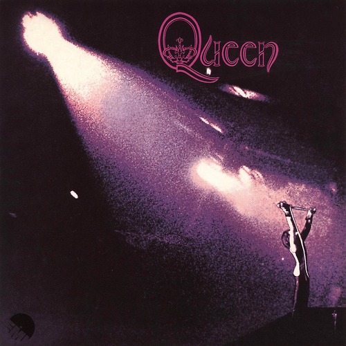
1. Queen
I normally go into the last entry of these things feeling burnt-out, and it’s often a toss-up of whether they will come out as the biggest, most long-winded entries on the list or the short cop-outs. I felt like it would probably be the latter here, but I just look at that image and it inspires me.
It’s rock n’ roll. That’s all it is, and that’s all it needs to be. It’s the music that I love distilled into one perfect image. It has a unique majesty on par with that of Made in Heaven. And that makes for really nice bookends too, as Queen is the first studio album, and Made in Heaven is the last. I can only imagine looking at this album cover at the time it was released, but I’m pretty sure it’s the kind of thing you’d look at and be like “these guys know that they’re going to be big.”
I really love the use of the purple lighting too, and I feel like it’s a pretty uncommon colour where album covers are concerned. Of course, that’s a pretty broad statement, and my reasoning is grounded entirely in the fact that it’s the only album I own (physical or digital) that has purple as the cover’s main colour. To illustrate, I have two that are mainly pink, and seven thousand that are mostly red.
Man, I really just love that image though. It’s so great.
And there you have it, folks. I’d like to go on some kind of conclusory rant here, but don’t you think there are already enough words on this page? I surely do.