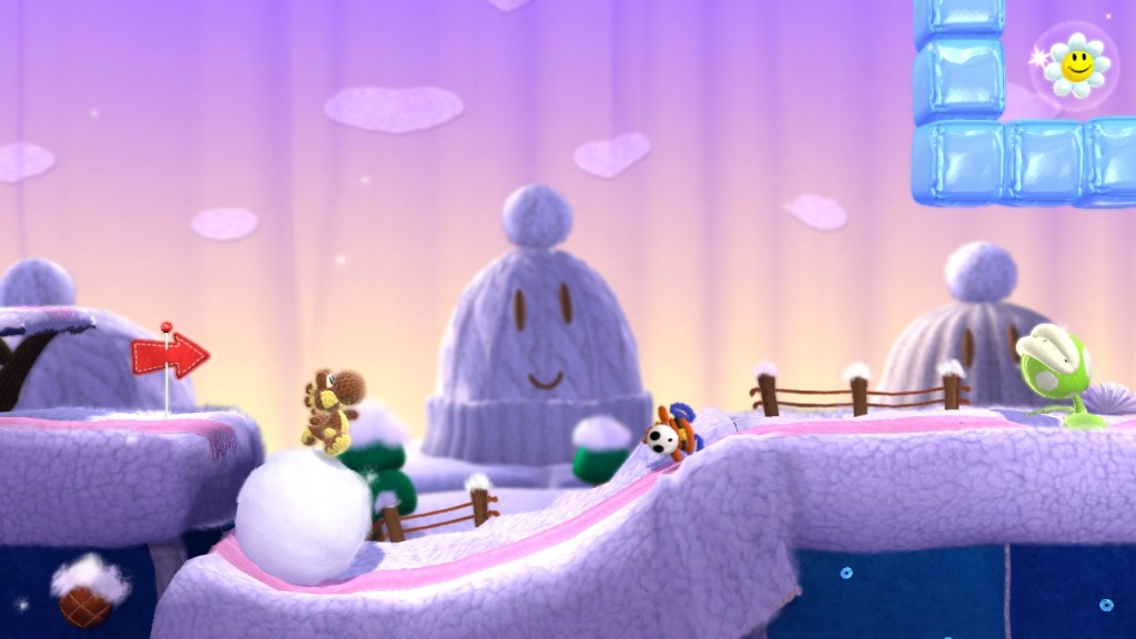
I have spent hours and hours (days, even!) researching and pondering it, and I believe that I have finally discovered all three things that are wrong with Yoshi’s Woolly World.
1. Too Many Costumes
Yarn Yoshi is damn near the cutest thing ever conceived (the crown goes to Yarn Poochy), so you already get that joy of watching cuddly little Yoshi waddle around as you play. But then, there are the costumes. Dozens and dozens of patterns to dress up Yoshi in, each more adorable than the last. Having to choose one to play as at any given time is an impossible task, and trying to select a costume has siphoned away hours of my life.
Granted, you have to earn them all, so if you aren’t collecting those smiling yarn skeins obsessively, you’ll only ever have to choose from the standard green and red Yoshis (which is still a struggle). The amiibo costumes can only be unlocked by scanning the corresponding amiibo, so that’s another saving grace, I guess. Buying them all is a massive hurdle in itself, and the monotony of scanning each one individually could kill a man.
Still, how am I supposed to get any levels played when I have to actively make a choice between Citrus Yoshi and Duck Hunt Yoshi? The game should really have included a random pattern spinner at the beginning of each stage.
2. The Appeal of the Woolly World
All I can think about when I stop playing Yoshi’s Woollly World is how much the real world sucks. I want to live in a world where everything is made out of craft materials, where any type of terrain is soft and plushy, and even the fiercest creatures are cute and huggable.
I have often said that I would love to live in a house made of pillows, and here Nintendo has realized that to some degree. Stages are built from knitted grasslands with yarn ball trees and bushes, mountains made of stacked cushions with scarves and doilies laid on top of them, and literal pillow forts. Sequins line the waters to make them sparkle. On the world map, there is a volcano that is a propped-up toque with a red and orange striped scarf draped over it as an approximation of a lava flow.
After visiting Yoshi’s Woolly World, reality just looks that much more awful.
3. The Start-up Screen
Every Wii U game has a little splash screen that shows up when you launch it. It sits there for a bit, and some of them are more complex than others. Some are a static screen, some have little animations, and some segue very smoothly into the actual title screen of the game.
The start-up screen for Yoshi’s Woolly world is actually three screens. First, an adorable image of Yoshi and Poochy. Second, a page with the logo and the three yarn Yoshi amiibos. Lastly, a chart of all the controllers that are compatible with this game. The actual images are not the issue.
No, the problem is the music. There’s a jolly little tune that plays on the loading screen, albeit very strangely. When the first picture changes to the second, the tune fades out and then restarts, which is a little jarring. And then when it’s showing the control options, the music just stops. That image tends to be the one that stays on-screen the longest, so you’re sitting there in silence for a good five-to-eight seconds. It’s really weird.
Oh, wait, that was almost an actual knock at the game in this post that was supposed to be humorously suggesting that Yoshi’s Woolly World actually has no faults. Opps!

